This is a student project I did of the M Ticket app in my own style.
Goal: To show the app's purpose in a very concise and fun way.
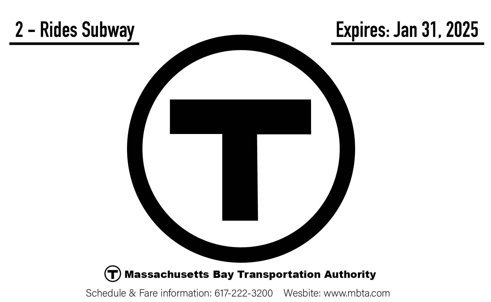
It was an exciting challenge because the final logo is a mere T. This gave me the opportunity to come up with some of my own designs like the ticket and train. My first storyboard is below and was the original plan decided upon before animating.
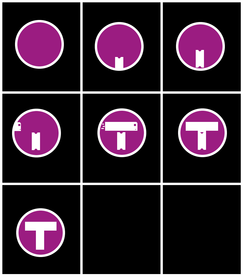
Once I began to animate however I realized I could do more. My final decision was to show a whole trip in a matter of seconds. The end product shows the scanning of a ticket followed a rapid train crossing. This demonstrates the ideal of the T to provide quick and dependable service.
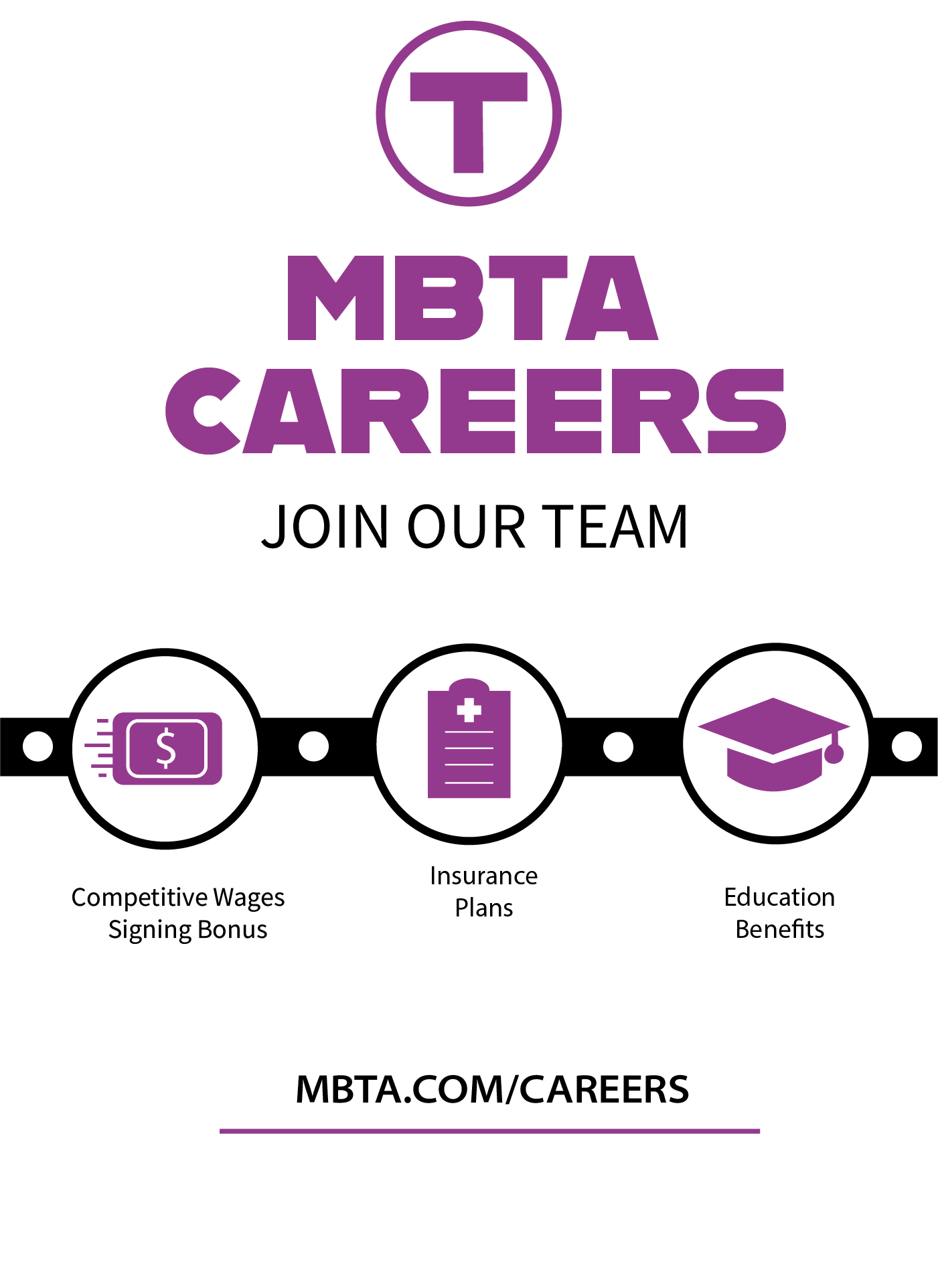
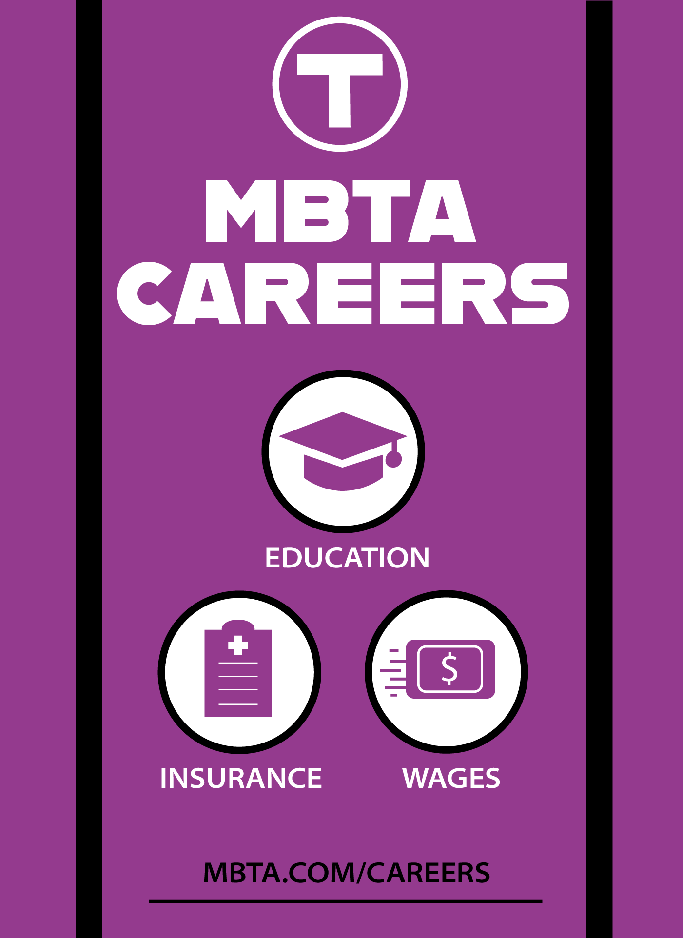
Next, I worked on creating posters making three variations and animating one of them.

Finally, I wanted to rework the Charlie Card and made three different designs.
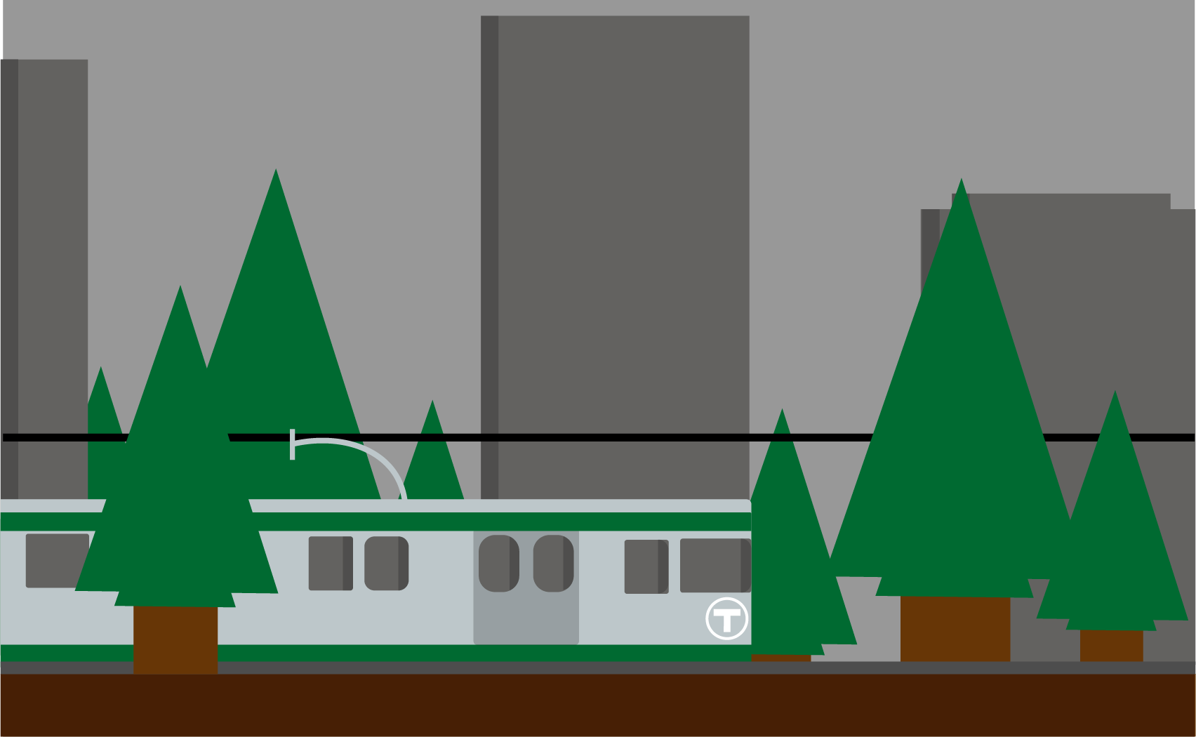
-Green Line Card: Represents the more nature surrounded green line.
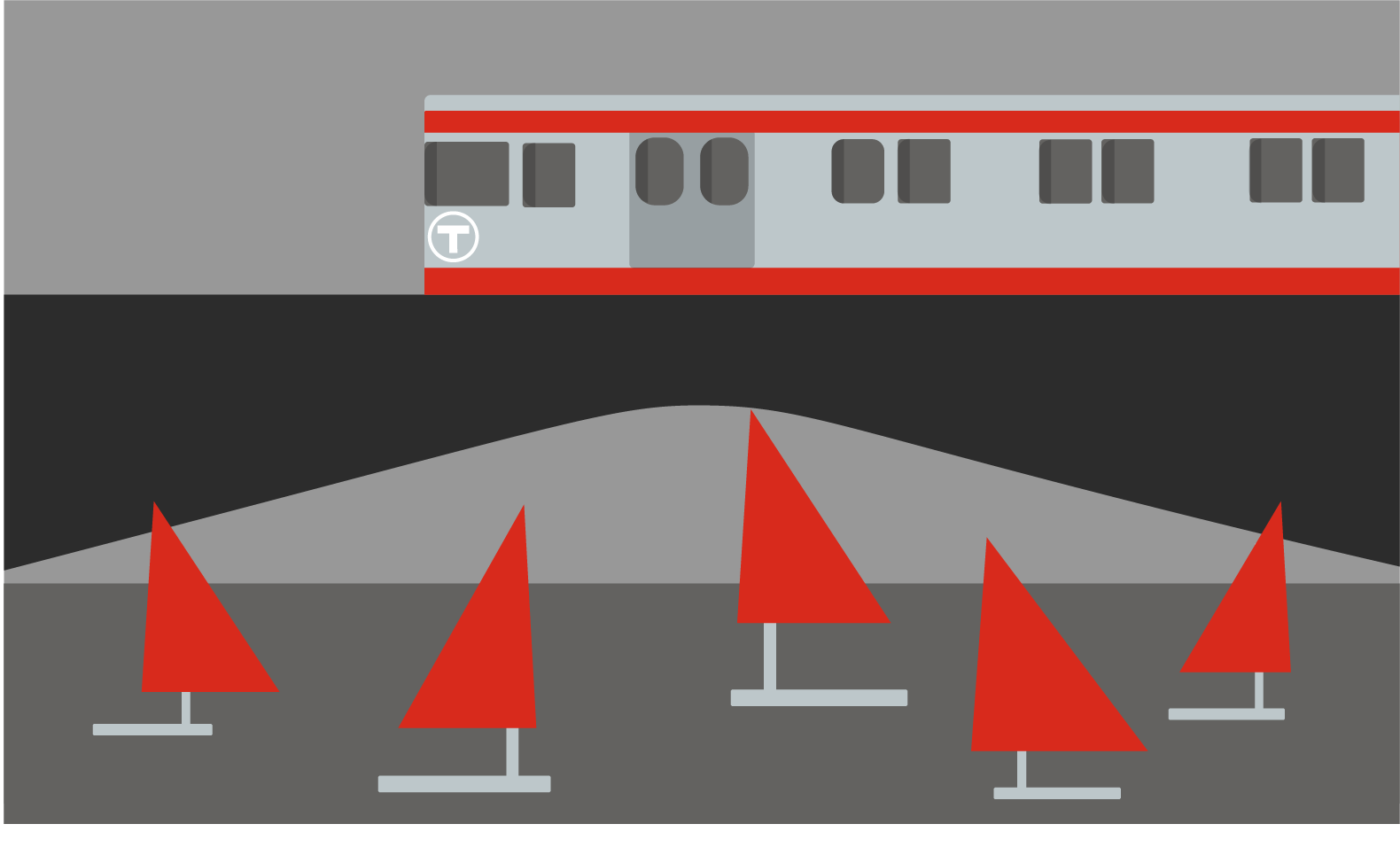
-Red Line Card: Shows the Longfellow bridge as an important element on the line.
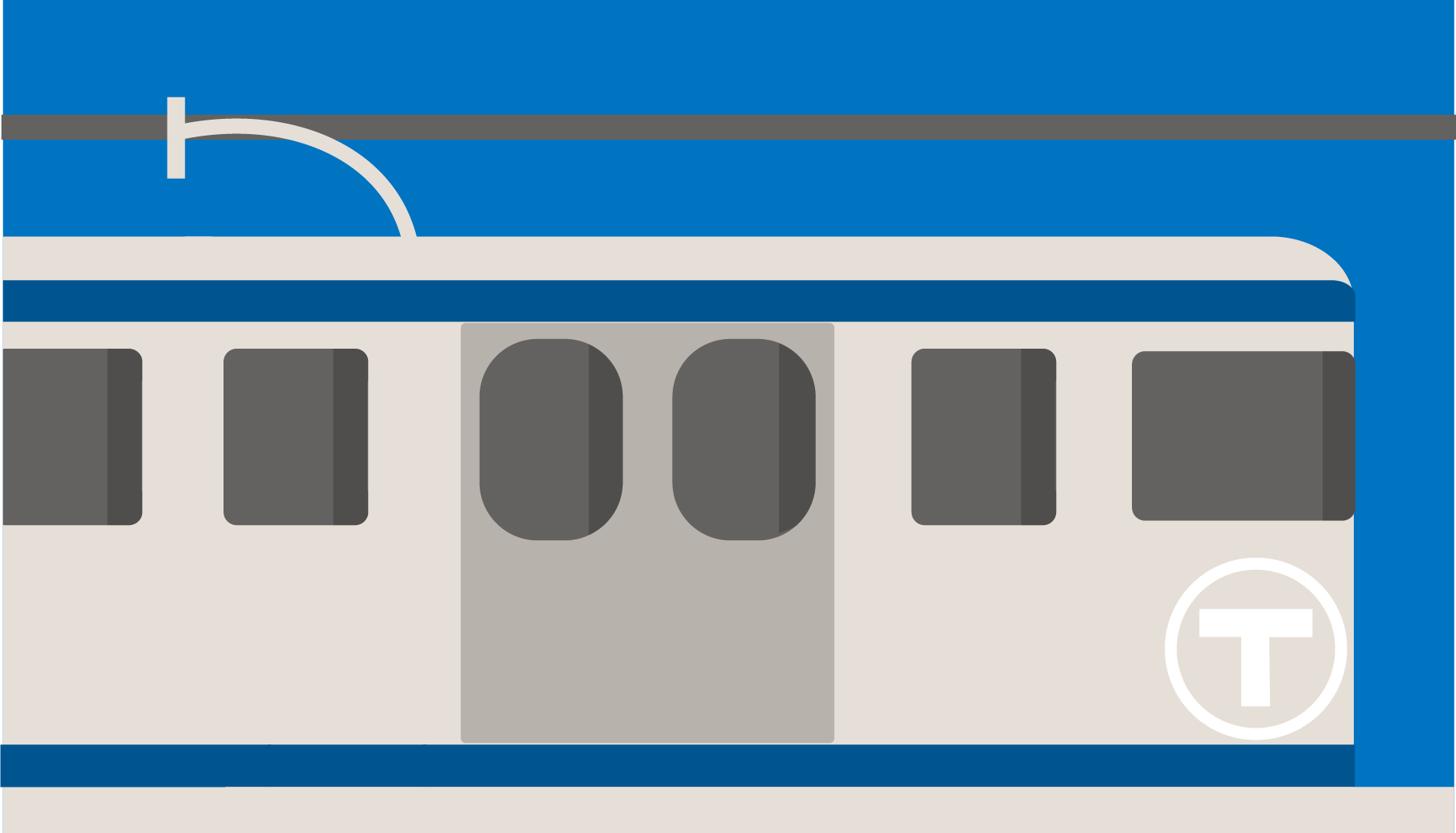
-Blue Line Card: Up close view of the train car with a light blue background.
Back of card